PPA Insights: Creating simulations for wind and solar production
The financials of renewable power and PPA contracts
Author: Cyriel de Jong, KYOS Energy Analytics
Creating simulations for wind and solar production

How to create simulations for wind and solar that work. In the previous article we provided insight into the dynamics of wind speeds, solar radiation and the corresponding power production. All these variables are strongly seasonal, can be zero for many hours in a row, and are often very volatile due to variations in climatic conditions. This also means that the modelling techniques to generate future scenarios of those time-series have to be different from those for commodity prices.
In this article we therefore present a methodology based on sampling from historical data. We also show how the simulations can be used to summarize the future production into meaningful statistics such as the P50 and P90.
Why are hourly data important for simulations?
Let us first look at some hourly data. Figure 1 contains the hypothetical solar production from the Spanish solar farm (in orange, left y-axis) and the wind speeds at our hypothetical wind farm in the North Sea (in blue, right y-axis).
The graph shows 8 days, 216 consecutive hours, from 30 August to 7 September 2008. A time-series of hourly solar radiation (or production) has zeros during the night, and then some sort of half-circle during the day. This pattern repeats itself from day to day. There are variations in the levels during the day, mainly due to cloudiness, leading to a disruption of the typical half-circle.
The wind speeds are more continuous, because there is no day-night pattern, but also quite volatile. Instead of hourly values, it would be much easier to model daily values for solar, to avoid the day-night pattern. For example, most time-series models that seem suitable assume a form of mean-reversion or auto-regression.
In such models, the level at time t is strongly dependent on the level at time t-1. That works well for wind speeds, but not for hourly solar data.
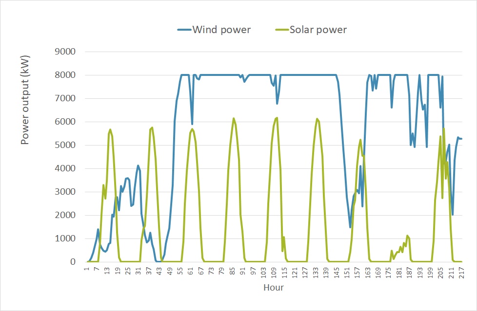
Figure 1: Solar and wind power output for the selected locations in Spain and the Dutch North Sea, from 30 August to 7 September 2008.
This brings us to the question of why we would like to generate hourly scenarios of wind and solar at all. Why is it not sufficient to do this on a daily, monthly or even yearly level?
The reason is that hourly prices are correlated to hourly renewable production. This correlation is negative and decreases the overall revenues.
Without hourly scenarios, we cannot capture this important feature. In the next few articles we will switch to prices, and also this correlation, but at this stage it is sufficient to know that the granularity should be hourly, or even half-hourly or quarter-hourly if power prices have that level of detail.
Smart sampling methodology for simulations
The accurate modelling of hourly wind in a time-series model is doable, for solar radiation very challenging. Even more difficult is to come up with a time-series model for multiple series of wind speeds and solar radiation. If it is windy in location A it is likely to be windy in nearby location B, though not always and it depends on the distance between A and B.
There can also be correlation between wind speeds and solar radiation: high wind speeds often coincide with clouds, so solar radiation is then low. Simple correlations will not suffice to capture all of these inter-dependencies. This is why we abandon the idea of a mathematical formulation (i.e. a time-series model) to describe the dynamics, but instead revert to sampling.
This means that future scenarios are generated by repeatedly picking data from the past. Luckily, this is very well possible, because of two reasons:
- There are often many years of historical weather data available, so there is a large pool with sufficient variation to take from.
- The weather is strongly cyclical with relatively short cycles of generally not more than 5-10 days. For example, when it is very sunny today, then it is more likely to be sunny tomorrow as well, but it does not make it much more likely to be sunny in 10 days. Also, from one day to the next the weather can change quite abruptly.
 We take advantage of these characteristics when creating future scenarios. The sampling methodology creates N future weather scenarios (e.g. with N = 1000), for future years F1 to F2 (e.g. from 2021 to 2030), using past weather data of the years P1 to P2 (e.g. from 2005 to 2016), by sampling in blocks of 2 weeks.
This means, for each scenario j:
- Randomly select a year P(j,1) from the past: P1 <= P(j,1) <= P2
- Take the first 2 weeks from that historical year to collect 2 x 7 x 24 = 288 hours of weather data. This is the scenario for the first 2 weeks in the future.
- Randomly select a new year P(j,2) from the past.
- Take the second 2-weekly period from that year P(j,2) to collect a new series of 288 hours of weather data. This is the scenario for the second 2 weeks in the future. Concatenate (“glue”) this to the first 2 weeks.
- Repeat step 3 and 4 multiple times till the scenario reaches the end of the future horizon.
The actual implementation of this algorithm in the KYOS software has a few refinements. Firstly, any daylight switches are removed from the data to avoid awkward hourly shifts in the solar radiation simulations.
Secondly, the period of 2 weeks is slightly randomized, so it is sometimes a bit shorter, sometimes longer. A potential drawback of this methodology is that the transitions between one 2-weekly block to the next is abrupt.
However, the average weather conditions in a 2-weekly block, is quite independent from the average weather in a following 2-weekly block, when corrected for the general seasonal pattern. Importantly, it has no real impact on the production and earnings distributions (production x price) or the PPA valuation and risk analysis, which is our ultimate goal.
On the positive side: this method is flexible, fast and accurately captures the time-series dynamics of a combination of weather series, including the correlation structure between the series.
The P-levels
Although it is important to generate the volume and price simulations per hour, the results are better understood if averaged per month or year. Figure 2 shows the distribution of the average annual production, derived from 2,000 simulation paths.
Both distributions are quite symmetric, but for the wind farm it is clearly wider than for the solar farm. An extremely windy year adds around 10% to the average output of the wind farm, while an extremely sunny year adds only 5% to the average of the solar park.
Figure 1 also shows the P90 level, which is the level that is exceeded 90% of the time. Or stated otherwise, there is only a 10% chance that the annual production falls below this level. Consistent with the wider distribution, for the wind farm this P90 is almost twice as far away from the mean than for the solar park (-6.7% versus -3.5%).
The P90 levels are also important in several PPA term sheets. It is a level which the asset owner is quite surely going to produce. For example, the PPA might have a fixed contract price of F for all volumes up to the P90 level, and a spot-indexed price for any additional volumes.
The P90 can also be assessed for each month individually. See figure 3. The P90 (or e.g. P75 or P50), is often used to structure a monthly baseload PPA. In such a contract, the producer delivers a fixed volume each month equal to the estimated P90. The consequence is that the asset owner, the PPA seller, has to manage the volume fluctuations, but can expect that these generally constitute an upside which can be sold in the market to generate extra revenues.
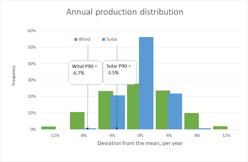
Figure 2: Histogram of the production of the North Sea wind turbine and Spanish solar park in a single year, derived from 2,000 simulation paths. For ease of comparison, the production is expressed as a percentage deviation from the mean production
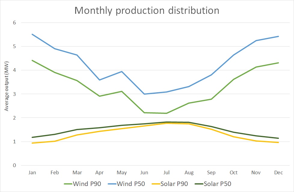
Figure 3: Monthly distribution of the average output of the North Sea wind turbine and Spanish solar park in a single year, derived from 2,000 simulation paths. The graph shows the P50 (median) and P90 levels, i.e. the levels which are exceeded with 50% and with 90% chance.
This finishes our discussion of the production dynamics and explanation of how they can be simulated using a smart historical sampling methodology. In the forthcoming articles the attention is shifted to the other important building block: market prices.
To read this article in pdf: Creating simulations for wind and solar production – the financials of renewable power and PPA contracts
Feedback on our “Financials of renewable Power and PPAs”
We write the articles to share our knowledge and hope it provides a useful source of information for newcomers and experienced professionals alike. Each article will be a mix of qualitative description, some mathematical formulations and numerical examples.
Whether you are buying electricity for your company, developing new projects, working for a utility, providing financing, drafting policies, or just generally interested: we hope you read the articles with interest and share your feedback with us: info@kyos.com.