PPA Insights: Creating a price forward curve
The financials of renewable power and PPA contracts
Author: Cyriel de Jong, KYOS Energy Analytics
Creating a price forward curve – the statistical approach
 From this article onwards, we shift attention to the prices in the power market. Assuming a merchant operation, so no feed-in tariff, the renewable power will be sold to the market. We will investigate methodologies to assess future power price levels, assess the seasonal and peak/off-peak pattern in those prices, apply an hourly shape to price, generate scenarios of power prices, and make sure that we capture the negative correlation between prices and volumes.
This is a formidable task, and hence we split it up in a few pieces, gradually increasing the level of complexity:
• Creating a price forward curve using power market prices and statistics
• Creating a price forward curve using power market fundamentals
• Creating price scenarios using Monte Carlo simulation
• Creating price scenarios using a hybrid approach of Monte Carlo and market fundamentals
Market or fundamentals?
A forward curve defines the prices at which a contract for future delivery can be concluded today. It is an important element in the valuation of assets which are exposed to power market prices. In developed power markets, participants can trade in a range of contracts on an exchange or over-the-counter (OTC). Most liquid are the contracts for delivery in the front month and front year (i.e. the nearest full future month or year), but other delivery periods may be liquid too, and might even include weeks, weekends, balance-of-month or the working-days-next-week.
Products can furthermore be separated in the time period of delivery, with the bulk being baseload (same volume each hour), followed by peakload (e.g. Monday to Friday from 8 am to 8 pm in most of continental Europe). More exotic delivery hours, such as 4-hourly blocks are also quite common in some markets.
In less-developed power markets, with no or not so liquid forward prices, the patterns and price levels of a forward curve are derived from fundamental analysis. Fundamental analysis, also named the ‘merit-order approach’ is discussed in a later article. Its application is not restricted to less-developed markets: over longer horizons (more than 3-5 years) there are no market forward quotes and the statistical approach becomes unreliable.
Furthermore, further out in the future the market may undergo too many structural changes, and the historical-statistical approach becomes unreliable. Hybrid approaches are also possible. For example, many Japanese electricity market players rely on the MPX, a market price forward curve published on a daily basis by Mitsubishi Research Institute and KYOS. This PFC is based on a combination of statistical market price analysis and a fundamental merit-order analysis of the market.
Renewables affect price forward curves
A price forward curve (PFC) in power markets is essentially a mix between market and model, sometimes with more market and sometimes with more model – depending on the availability of accurate market data. The earlier definition that it represents “the prices at which a contract for future delivery can be concluded today” is therefore not entirely correct. Whether the curve has been generated with more market (prices) or more model (statistical or fundamental), two main types of patterns can be distinguished: seasonal (monthly) and within-season (daily-hourly).
Both types of price patterns are dependent on the dynamics of demand and renewable electricity production. For example, markets with large solar PV capacities tend to have a low price level in the summer in the middle of the day, the hours when sunshine is abundant. This could be partly offset by extra demand for air conditioning. The winter has its own weather dependencies. Most of the wind generation is often in winter (reducing price levels), but especially countries with a lot of electric heating see their demand surge on cold winter days.
A large part of the seasonal differences in power prices between France and the Netherlands can be explained by the dominance of gas-heating in the Netherlands and electric heating in France (figure 1).
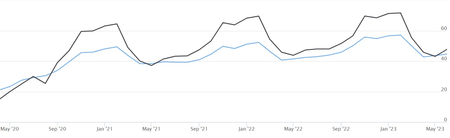
Figure 1: KYOS monthly price forward curve, peakload delivery, for France (black) and the Netherlands (blue), dated 3 April 2020, in €/MWh. Source: KYOS Analytical Platform
An interesting comparison is between German power prices and those of the Oslo area in Norway (part of Nordpool). See figure 2. In Norway, the dominant renewable generation is not solar or wind, but hydro, with a production share close to 100%. Due to the melting of snow and ice, there is more water in the spring and summer than in the winter and hence lower summer than winter prices. But apart from that, there is little variation in the prices: there is abundant flexibility to ramp up or down the production at virtually no marginal cost. Compared to Germany, where coal-, lignite- and gas-fired plants are the dominant marginal assets, Norway has a very flat hourly pattern, and a level almost always below Germany.
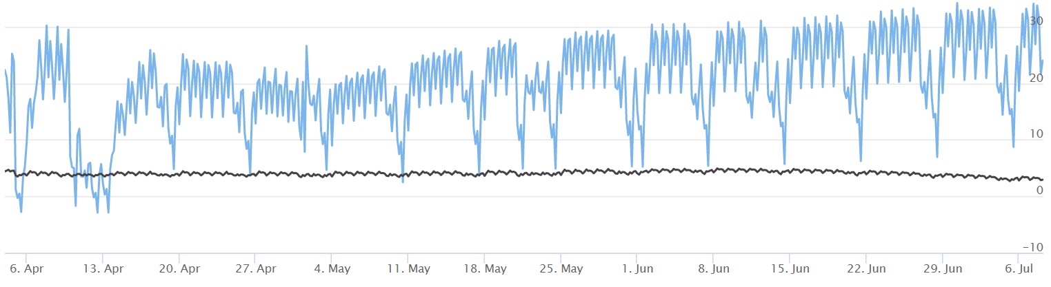
Figure 2: KYOS hourly price forward curve for Oslo area (black) and Germany (blue), dated 3 April 2020, in €/MWh. The graph shows the period from 4 April to 6 July 2020. Source: KYOS Analytical Platform
It might be hard to see in the graph, but the German price forward curve has a drop in the middle of the day, especially in summer periods. The highest prices are early morning around 8-9 am and early evening around 5-7 pm. In between, especially around 12-2 pm, the prices are lower due to the production from solar PV.
The resulting price pattern is often referred to as a camel-shape, or duck curve. This shape has become more pronounced over the years, and has largely emerged in parallel with the expansion of solar power capacities in Germany. Also, we can observe a decrease in power consumption on a utility and residential (behind the meter) level, which further reduces demand in the middle of the day. Similar developments in solar capacity and camel-shapes have taken place in other countries.
Market based forward curves
The forward curves in figures 1 and 2 are market based forward curves. They are derived from current and historical market prices only. Market based forward curve building is the science and art of constructing a continuous series of prices, based on the market quotations.
At first sight, that may seem simple, but there are various challenges (and solutions):
- Traded contracts are partially overlapping (weeks with months, months with quarters, etc)
- Traded contracts are available up to only a certain period ahead, generally not more than 3-4 years ahead
- Traded contracts are limited to just a few delivery periods (weeks, months, etc.) and delivery types (baseload, peakload, block 5, etc)
Based on this limited set of market information, the goal is to construct a forward curve with hourly granularity[1] . This curve should fulfil two primary objectives:
- Be arbitrage free to the market prices. This means that the average of the hourly prices in a certain period (e.g. 2022) should be exactly equal to the traded price for that period (e.g. baseload 2022 trading at 35 €/MWh).
- Have the correct seasonal, weekly and intra-daily (hourly) shapes. This means that the shapes should reflect the ‘expected’ patterns in future spot markets.
The first condition of being arbitrage-free may be challenging to achieve, but is easy to validate by calculating averages. The second condition is challenging as well and more subjective, because the expectation of participant A may be different from that of B. It is common practice in well-developed markets to use statistical analysis of historical patterns to forecast the future patterns in the next 3-5 years.
Monthly price forward curve
As an example of the forward curve building process, we have data of the Spanish power market on 8 May 2020. Spanish power futures are traded on EEX for individual months, quarters and calendar years. The vast majority of liquidity is in the shortest maturities, mainly month-ahead and year-ahead.
For the curve building we take settlement prices of the first 3 months, 3 quarters and 3 calendar years ahead. See figure 3. The first step of the curve building process is to derive monthly forward prices. The first 3 months (June-Aug 2020) are the settlement prices. The next month, September 2020 is easily derived to be 34.63 by taking the quarter-ahead (Jul-Sep 2020) and the July and August prices: the hourly weighted average of the 3 months should equal the quarter-ahead price. Note that when taking lower liquidity products, this results in less accurate quote prices and potentially unrealistic shapes in the curve. Therefore, choosing a tradable horizon is important for each type of product. Furthermore, we also apply shaping from a liquid market to a more non-liquid one.
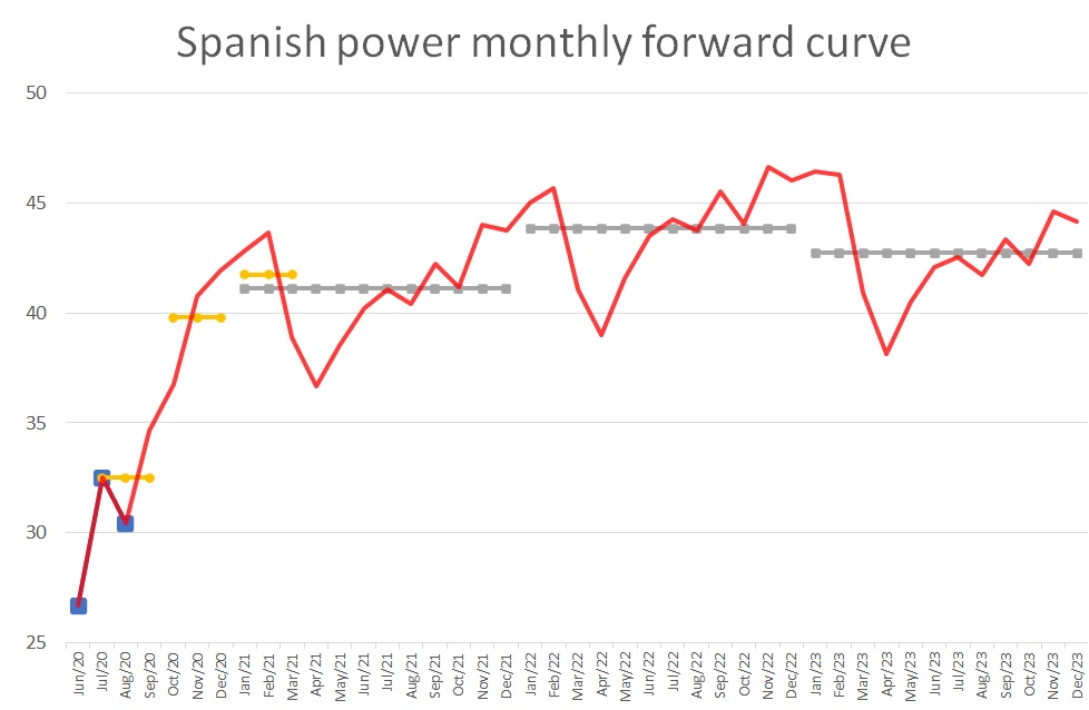
Figure 3 Monthly baseload price forward curve for Spanish power, dated 8 May 2020, in €/MWh. The blue dots are the monthly, the yellow dots the quarterly and the grey dots the yearly EEX settlement prices. The monthly price forward curve (red) is arbitrage-free to those settlement prices.
From October 2020 onwards, the information is much more limited. The two remaining quarter-ahead prices and year-ahead prices must be broken down into months. This requires shaping factors which are derived from historical forward price relationships.
For example, if the February forward price has historically been trading around 12.5% above the March forward price (e.g. in the liquid trading window for those months November-December 2019), then it is reasonable to enforce this relationship on the February and March prices in 2021 – 2023.
Considering all relationships between adjacent months, all measured in their trading horizon, leads to the monthly weighting factors as displayed in figure 4.
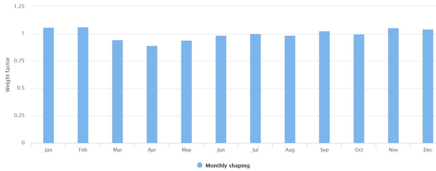
Figure 4: Monthly weighting factors to construct the baseload price forward curve for Spanish power. Source: KYOS Analytical Platform.
Hourly price forward curve
The monthly price forward curve can be derived separately for baseload and peakload, but ultimately market participants require an hourly shaped curve. For short-term trading activities, this complements the curve with a detailed shape in the front-end, using short-term forward price quotations (if available) from weekends, working-days-next-week, weeks, and so on.
But also further out on the curve, an hourly detail is useful, for example to determine shaping costs and capture rates. Whereas the monthly shaping is solely based on forward quotations, for the daily and hourly shaping spot prices are used. With statistical methods using historical hourly spot prices, a forward curve model derives 24-hourly shapes for different weekdays and seasons.
It is typical to use not more than about 1-2 years of history, because hourly shapes tend to change over time. Figure 5 provides a great example of such a structural shape change. Until around 10 years ago, the German hourly spot prices on working days were highest around noon, and this is reflected in the shape of the hourly price forward curve. For over a decade now, Germany has been expanding its solar power production, up to a level where it can fulfil more than 50% of total demand when weather conditions are good.
Especially in summer, this has gradually but steadily flattened the hourly shape and even pushed the midday prices ever more below the early morning and late afternoon. The shape has turned from a pyramid into a camel.
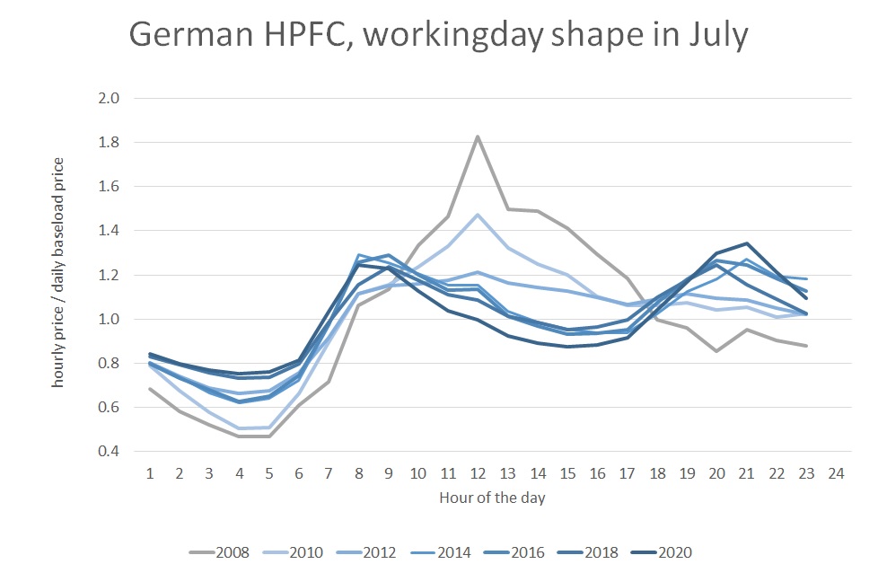
Figure 5: Hourly shape in the German power price forward curve for a working day in July. Source: KYOS price forward curve service, www.pricecurves.com.
Price forward curves and capture rates
How does the forward curve influence the value of a PPA contract? To understand this better, we use the concept of a capture rate. Obviously, a high average (expected) power price, a high level of the forward curve, increases the expected income of the asset. The influence of the seasonal and hourly price patterns in a forward curve are more subtle, but non-negligible.
As a reminder, the capture rate is the average price at which an asset produces, divided by the baseload price. A power plant producing baseload has a capture rate of 100%. More or less the only type of renewable energy that produces baseload is tidal energy: its production is quite flat over the day and across seasons.
A peaking unit, or flexible (reservoir) hydro power plant, on the other hand, only produces when power prices are high, and hence has a capture rate of e.g. 200% (but with much lower total production). Non-dispatchable renewable generation assets mostly have a capture rate below 100%. This is the so-called cannibalization effect: with more and more production from the same type of renewable generation, the realized prices go down.
Exactly when an individual wind turbine produces power, many other turbines do so too, and hence the average capture price is low. The same applies to solar. In some cases, the price may even be 0 or negative.
In a market where solar is the dominant form of renewable generation, prices tend to be low in the middle of the day. For example, if we consider each month individually, this pushes the effective price for solar assets below the monthly average prices.
For wind, the same is true, but the effect of the wind, pushing effective prices down, happens more randomly, during day or night.
Some wind farms experience slightly non-correlated production patterns resulting in higher capture rates. On top of that, there may also be a seasonal effect.
Sometimes this works against renewables, sometimes not. For example, power demand may be higher in the winter, which is beneficial for owners of wind farms if they also produce more in the winter. Under similar conditions however, the seasonal pattern works against the capture rates for solar producers.
Fundamentals for the future
If market prices are available, then market based forward curves are the first choice for valuing energy assets and contracts, including PPAs. However, liquidity in forward products is only available up to a certain number of years ahead, often not more than about 3-4 years. Beyond that horizon, a different approach is needed. This is not only to determine the future levels, but also the future intra-yearly (seasonal) and intra-daily shapes.
The further we look ahead, the more fundamental changes are going to affect the power prices. We have seen in the German market how the intra-daily shape has completely changed in about 10 years’ time. Similar changes have happened in other markets and will happen going forward.
This is where fundamental modelling of power markets proofs its value: it yields forecasts of future power prices, and forecasts of future capture rates, taking into account changes in supply and demand. Fundamental modelling helps us to understand how this is going to affect the value of renewable assets and is therefore the central theme in the next article.
Feedback on our “Financials of renewable Power and PPAs”
We write the articles to share our knowledge and hope it provides a useful source of information for newcomers and experienced professionals alike. Each article will be a mix of qualitative description, some mathematical formulations and numerical examples.
Whether you are buying electricity for your company, developing new projects, working for a utility, providing financing, drafting policies, or just generally interested: we hope you read the articles with interest and share your feedback with us: info@kyos.com.
To view this article in pdf: Creating price forward curves – the financials of renewable power and PPA contracts
[1] In some markets, such as in Great Britain and Japan, spot markets are organized per half-hour and hence the desired granularity of the forward curve is half-hourly